
1. Overview
The Involv Bynder Media component places a single asset from your Bynder library on an intranet page. Bynder is a digital asset management system: the place where your organisation keeps the approved versions of logos, photos, brochures and other material.
The point of the component is that the file is not copied. The page refers to the asset in Bynder, so colleagues see what marketing approved, and an asset that is replaced in Bynder does not leave an outdated copy behind on the intranet.
Note that this component shows one asset, not a gallery. Do you want three images on a page, then you add the component three times.
This is a dedicated integration with Bynder, so it only works if your organisation actually uses Bynder. You connect to your own brand portal from the component itself, which is covered in section 4.
2. What you'll learn
- How to add the Involv Bynder Media component to a page
- How to place an asset on the page
- What the difference is between an image and a document
- How to use an image as the page header or the page thumbnail
- What the fields in the properties panel mean
3. Add the component to a page
Open the page in edit mode and click the + to add a component. Search for Involv Bynder Media and select it.
The component starts empty, with a single Add Asset button. That button is the whole starting point: everything else follows from the asset you choose.

4. Connect to your brand portal
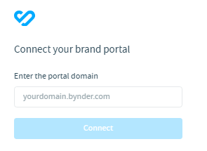
Click Add Asset. Before you can pick anything, Bynder asks which brand portal to use: enter your portal domain in the form yourdomain.bynder.com and click Connect.
This is the step people get stuck on. The connection is not arranged somewhere centrally in the intranet, it happens here, in the component. If you do not know your portal domain, ask whoever manages Bynder in your organisation. It is the same address they use to open Bynder themselves.
Once connected, the Bynder library opens and you select the asset you want on the page.
5. Place an image
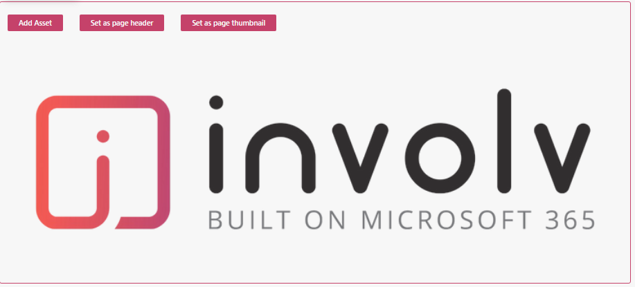
Choose an image as your asset and the component shows it at the full width of the section, with two extra buttons above it.
Set as page header uses the image as the header of the page. Set as page thumbnail uses it as the image shown when the page appears elsewhere, for instance in a news overview or a search result.
These two buttons are worth knowing about. They mean the visual of a page comes straight from the approved library, instead of someone downloading an image, saving it somewhere and uploading it again. The version on your page stays the version marketing signed off on.
6. Place a document
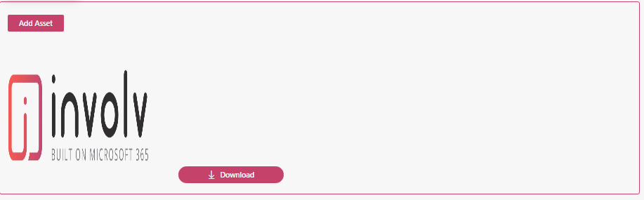
Choose a document and the component shows a preview with a Download button underneath. Colleagues read what the document is and download it from the page, again without a copy being made anywhere.
7. The fields in the properties panel
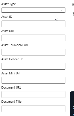
Click the pencil icon and the panel shows the properties of the asset you placed:
- Asset Type — the kind of asset, which determines how the component displays it. Image and Document each have their own layout, as described above.
- Asset ID — the identifier of the asset in Bynder
- Asset URL — the address of the asset itself
- Asset Thumbnail Url, Asset Header Url, Asset Mini Url — the different sizes Bynder keeps of the same asset, used where a smaller version is needed
- Document URL and Document Title — the address and the name used for a document
These fields are filled in when you place an asset. Leave them alone unless you know exactly what you are changing: a wrong value here means a broken image or a download that leads nowhere, and nothing warns you about it.
8. Audience, styling and mobile visibility
Under Target Audience Settings, switch on Enable target audience if the asset should only be visible to part of the organisation, based on your Microsoft 365 groups.
Element ID and Class lets you add a Custom CSS class or a Custom element ID for custom styling, and Show in mobile and email view under Visibility controls whether the component also appears in the mobile app and in email views.
9. Result
Your page now carries an asset that lives in Bynder rather than on the intranet, and an image can serve as the header or the thumbnail of the page without anyone having to download and re-upload it.
For related topics, see How to add a visual? and What are the best image sizes and aspect ratios for SharePoint modern pages?
Involv version 5.4