
1. Overview
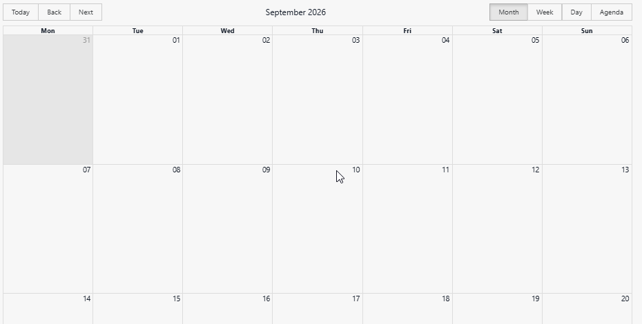
The Involv Calendar component displays the items of a SharePoint library as a calendar on an intranet page. Visitors switch between a month, week, day and agenda view and browse forwards and backwards through the dates.
The component does not hold any data of its own. You point it at a site and a library, tell it which columns hold the title, the description and the dates, and it places those items on the calendar. That makes it flexible: a team's planning list, a list of training sessions or a maintenance schedule all become a calendar without anything being copied.
2. What you'll learn
- How to add the Involv Calendar component to a page
- How to point the component at the right site and library
- How to map the fields of your library to the calendar
- Where to limit the component to a specific audience
- How to apply caching and custom styling to the component
3. Add the Involv Calendar component to a page
Open the page in edit mode and click the + to add a component. Search for Involv Calendar and select it. Click the pencil icon on the component toolbar to open the settings panel on the right.
The panel is grouped into General, Fields settings, Technical Settings, Element ID and Class, Target Audience Settings, About and Visibility. Note the Apply button at the bottom of the panel: this component only takes your settings into account after you click it. If the calendar does not change while you are configuring it, that button is usually the reason.
4. Point the component at a site and a library
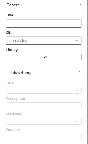
In the General group, Title is the heading shown above the calendar. Leave it empty when the page already has a heading of its own.
Site selects the site that holds your data, and Library selects the library on that site. Choose the site first: the Library dropdown is filled with what is available on the site you picked.
Take a moment over this choice, because it also decides who sees what. The calendar respects the permissions of the underlying library, so a user who cannot open the library will not see its items appear on the calendar either.
5. Map the fields to the columns of your library
The Fields settings group stays greyed out until you have selected a library — the component first needs to know which columns it can offer you. Once a library is selected, four dropdowns become available:
- Title — the column shown as the name of the item on the calendar
- Description — the column with the explanatory text
- Startdate — the column that determines when the item starts
- Enddate — the column that determines when it ends
Map at least the title and the start date. Without a start date the component has nothing to place on the calendar, and without a title your visitors see items without a name. The end date is what makes an item run across several days instead of appearing on one.
Click Apply when you are done, then save or publish the page.
6. Limit the component to a specific audience
Under Target Audience Settings, switch on Enable target audience if the calendar should only be visible to part of the organisation. This uses the same audience targeting as the rest of Involv intranet, based on your Microsoft 365 groups.
Audience targeting hides the component from people it is not meant for; it does not grant access to the underlying library. The permissions on the library remain the deciding factor for the content itself.
7. Apply caching, styling and mobile visibility
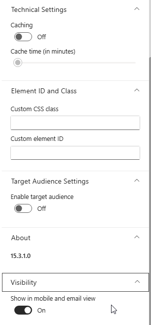
Technical Settings contains Caching and Cache time (in minutes). Caching reduces the number of calls to the library, at the cost of showing slightly older data. For a stable planning that is agreed weeks in advance, caching is a sensible way to lighten a busy page. For a calendar that changes during the day, leave it off — a cached calendar shows a meeting that has already been moved.
Element ID and Class lets you add a Custom CSS class or a Custom element ID. Use these only when your organisation applies custom styling.
Under Visibility, Show in mobile and email view controls whether the component also appears in the mobile app and in email views.
The About group shows the version of the component, which is useful when reporting an issue to support.
8. Result
Your page now shows a working calendar. Visitors use Today, Back and Next to move through the dates, and switch between Month, Week, Day and Agenda in the top-right corner. Month gives the overview, Week and Day are for a detailed planning, and Agenda lists what is coming up as a straight list — often the most readable view on a narrow screen.

For related topics, see How to create an event? and How to add a component on a page?
Involv version 5.4