
. Overview
The Involv Ideation component turns a page into a place where colleagues share ideas. Users submit an idea with a title, a description and tags; everyone else can search through the ideas, like them, comment on them and add them to their favourites.
Because the component is configurable, the same set of ideas can be presented in different ways on different pages. A dedicated innovation page can show the full idea pool with search and filters, while a department home page shows only the single top idea of the month. You add the component as many times as you need and give each instance its own settings.

2. What you'll learn
- How to add the Involv Ideation component to a page
- How to choose a template and decide how many ideas are shown
- How to sort ideas by popularity, engagement or date
- How to decide whether users can search, filter and post anonymously
- How users submit an idea and engage with the ideas of others
3. Add the Involv Ideation component to a page
Open the page in edit mode and click the + to add a component. Search for Involv Ideation and select it. Click the pencil icon on the component toolbar to open the settings panel on the right.
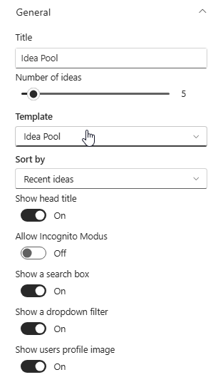
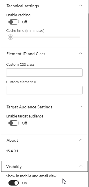
The panel is grouped into General, Technical settings, Element ID and Class, Target Audience Settings, About and Visibility. Everything that determines what users see sits in General.
4. Choose the template, the number of ideas and the sort order
Title is the heading of this instance of the component, for example Idea Pool or Idea of The Month. It is only displayed when Show head title is switched on, so you can leave the component untitled on a page that already has a clear heading of its own.
Template determines the layout. There are three. Idea Pool shows the full, searchable list of ideas and suits a dedicated ideation page. Fast View shows a compact list, which works well when ideas are one block among several on a page. Idea of The Month spotlights a single idea, so use it together with a low number of ideas and a sort order that puts the best one first.
Number of ideas sets how many ideas the component shows. Match it to the template: a full idea pool can carry five or more, while a spotlight is meant to show one.
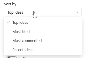
Sort by decides which ideas rise to the top. Top ideas and Most liked reward what colleagues support, Most commented surfaces what is being discussed, and Recent ideas keeps the component moving by showing the newest submissions first. On a page meant to encourage participation, Recent ideas makes sure a new contribution is visible immediately; on a page meant to show results, Top ideas is the better choice.
5. Decide what users can do on the component
The remaining toggles in General control the interaction.
Show a search box and Show a dropdown filter add a search field and a filter above the list. Both are useful once the idea pool grows, and both are noise on a component that shows a single idea — switch them off there.
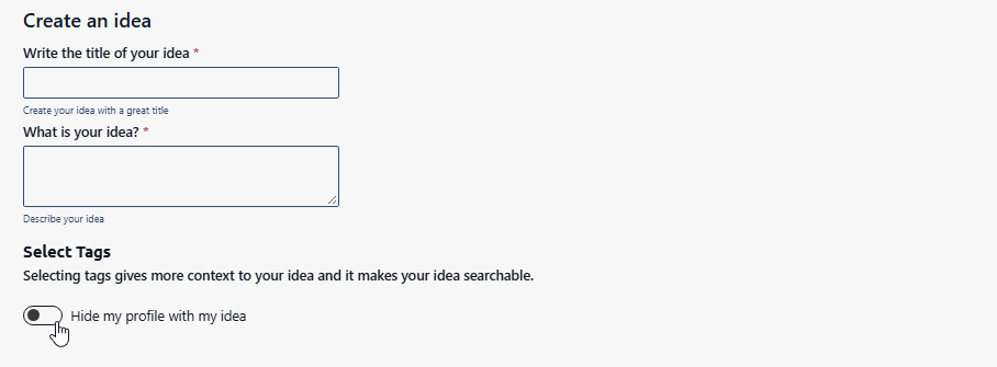
Allow Incognito Modus gives users the choice to stay anonymous. When it is switched on, the Create an idea panel shows an extra Hide my profile with my idea toggle, so the person decides per idea whether their name and photo are attached to it. Switch it on when you expect sensitive suggestions and anonymity will increase participation; leave it off when ideas should stay attributable, so colleagues can follow up with the person who submitted them.
Show users profile image displays the photo of the person behind each idea. Keep it on to make the wall of ideas feel like colleagues rather than entries in a list.
6. Limit the component to a specific audience
Under Target Audience Settings, switch on Enable target audience if the component should only be visible to part of the organisation. This uses the same audience targeting as the rest of Involv intranet, based on your Microsoft 365 groups.
This is useful when a page is shared across departments but the ideation campaign only runs in one of them.
7. Apply caching, styling and mobile visibility
Technical settings contains Enable caching and Cache time (in minutes). Caching reduces the number of calls the component makes, at the cost of showing slightly older data. Be careful here: ideas, likes and comments change continuously, and a cached component makes a new idea look like it was never submitted. Leave caching off unless the component sits on a very busy page and a short delay is acceptable.
Element ID and Class lets you add a Custom CSS class or a Custom element ID. Use these only when your organisation applies custom styling.
Under Visibility, Show in mobile and email view controls whether the component also appears in the mobile app and in email views. Keep it on if you want ideas from colleagues who work without a desk.
The About group shows the version of the component, which is useful when reporting an issue to support.
8. How users submit and engage with ideas
Users add an idea with the + button in the top-right corner of the component. The Create an idea panel asks for a title and a description — both are required — and lets the user select tags. Tags are worth explaining to your users: they give the idea context and make it findable through the search box.
After clicking Send, the idea appears in the component. From there colleagues can Like it, Comment on it and Add it to favorites, and those reactions are exactly what the Top ideas, Most liked and Most commented sort orders are built on.
9. Result
Your page now carries a working ideation component: colleagues can submit ideas, tag them, and support each other's suggestions, while you control how many ideas appear and which ones come first. Add the component again elsewhere with a different template to highlight the best ideas where more people will see them.
For related topics, see How to add a component on a page? and How to change the title of a component?
Involv version 5.4